


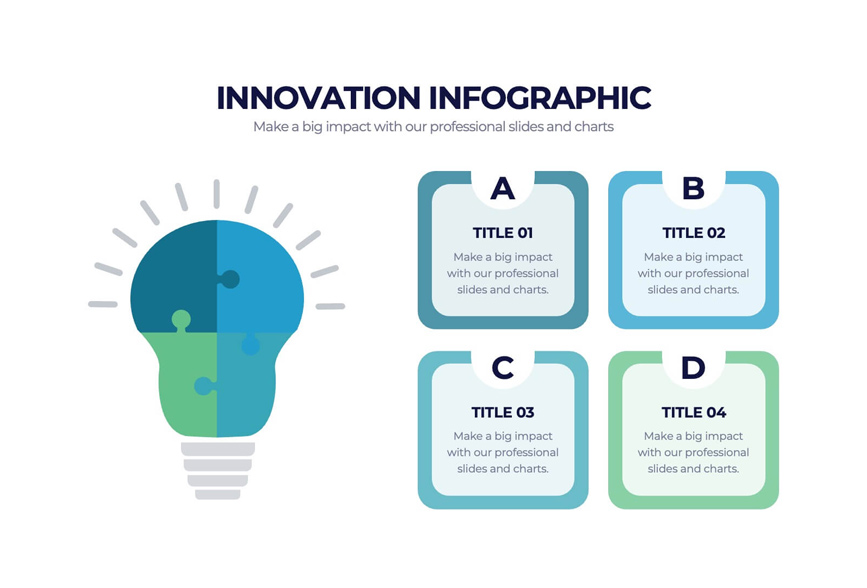
The use of new technologies is altering the way people do their work, communicate, learn and work through day-to-day issues. There are many innovations that are difficult to grasp when not explained, such as artificial intelligence and robotics, cloud computing and smart devices. It is often difficult to understand the technologies because of the use of technical terms, complex processes or unfamiliar concepts. Use of infographics can be a very practical method to make intricate data comprehensible. They present ideas in a visual format using short text, illustrations, charts and/or diagrams. Infographic content creation by businesses and educators can help to explain technical topics in an easy-to-understand and captivating manner. When you create a well planned infographic, you’re able to present to your readers information that needs to be understood in a short span of time and without them having to read long technical documents.
Identify the Purpose of Your Infographic
When creating an infographic, determine the things that you want your audience to take away from the design. There are a lot of topics associated with new technologies and if you attempt to explain all of it in a single design, it can bewilder readers. Rather, concentrate on a particular question and/or idea. For instance, if the AI system being explained is an infographic, it could be used to illustrate how the system works. Another could be a comparison between something that is traditionally done with software and something that is done with AI powered software. A clear purpose helps in selecting the pertinent information and more easily sketch a logical visual story.
Understand Your Target Audience
You can tell your infographic’s message in a variety of ways, depending on your audience.. Simple definitions and examples are normally required to be understood by beginners. For more advanced users, comparisons, technical diagrams or even actual performance details may be required. If you’re making an infographic about cloud computing for small business owners, for instance, you’d be able to add data on storing things online, accessing them from afar and working together on them. There might be a version specifically for IT professionals that would focus more on the infrastructure, security and system architecture. Knowing your target audience enables you to create infographic that doesn’t overload your audience with irrelevant information, but answers their inquiries.
Accurately and reliably research information
Official product documentation, research papers, university publications and technology organizations are good sources of information. When talking about recent developments, verify the dates of the publications and verify if the information is up-to-date or not related to the current capabilities. Identify and distinguish between facts and predictions. For instance, a technology could be beneficial for the efficiency of the workplace but the actual outcome of the technology could be influenced by the implementation, cost and workplace environment. Gather the most relevant facts, examples and explanations before going onto the design process. Be sure to have details of any statistics or technical claims in hand. This way your infographic will be more reliable, and easier to maintain in the future.
Make it easy for children to follow simple steps
There are technologies which make use of processes that are hard to explain utilizing common paragraphs. Steps are used to break down these processes, so that readers can easily understand the working of different parts. Think of making an infographic that helps to explain facial recognition. The content might be divided into parts such as image capture, feature detection, comparing to a pattern and verification of identity. There would be a brief explanation for each stage with a corresponding visual that would accompany it. This step by step technique is suitable for digital payment systems, renewable energy systems, machine learning and automation. In a concept that is very difficult to explain, resort to common analogies.
Select the Layout of the Infographic that is best suited
The layout must enable you to communicate the information that you want to. Various patterns of composition are successful with various subjects. A process infographic can be helpful to understand the workings of a technology. Comparisons can be used to emphasize the difference between two tools in a comparison layout. A timeline can be used to depict the evolution of an innovation and a flowchart can be used to explain the flow of information in a system. In creating infographic designs, arrange the content in such a way that it can be easily followed by a reader from beginning to end. Organize the information into sections with headings and group information together. Don’t over-populate an area. White space allows text and illustrations to “breathe”, and makes the end design easier to read on computers and other mobile devices.
6. Use Visuals That Support the Explanation
The images in your document should be a representation of what is written. They should not be just for show. You can have icons, diagrams, illustrations and charts to emphasize the interaction between different kinds of technical information. For instance, if you’re creating an infographic on smart home technology, you could add icons for smart light bulbs, security cameras, thermostats and voice assistants. Use a small number of colours in your design. When presenting data charted, include a label on each axis and a source of your data. Lastly, don’t make artsy-and- crafty graphs that make the differences between the items you are comparing look different than they actually are, or include unworthy statements.
Spelling: Use Correct Spelling
When composing, stick to simple English. If using special terminology is necessary, explain it concisely and simply. For example, if one has a data set, Machine Learning (ML) can be used to detect patterns in the data set, and in effect, to enhance performance on a given task after experience. The title of the infographic should give an idea to the reader of what they’ll get out of it. Each idea should be summarised in a secondary heading, which should be brief. Captions should be a couple of sentences long and give reasons for the reader’s viewing the picture. Don’t add too much text to the design of your infographic. Readers won’t make it to the end of the infographic if there is too much to read. Take each sentence in the work and eliminate any sentences which do not restate the main idea.
Create a poster to accompany the presentation
To create an engaging infographic you don’t need to be an expert in graphic design. The following online resources offer you templates, icons, charts and editing of images. Select a resource to alter the layout, font, colour scheme, and also add pictures. Although templates can save you time, select the one that is appropriate to the topic and audience. When developing a technology infographic, it must demonstrate a focus on technology instead of merely being a sales pitch. Check for font sizes and alignments, contrast levels, correct spelling and high-quality images prior to releasing. Make sure that the design is legible on smaller screens.
Analyze and post/present Your Infographic
Check your design while making sure it’s complete prior to showing it off to your audience. Ask someone who isn’t familiar with your topic to look at your design and provide a summary of the main idea of your design. Make sure your design provides sufficient contrast between the background colors of your design and the information presented on your design. Don’t convey any critical information in your design solely through color. Once you’ve created your final product, you can publish your final product on your website, blog, social media accounts or your educational resources section of your website. Provide a descriptive statement about your final product when publishing it on the internet to assist readers in understanding the purpose of your final product. You may also provide a short introduction to your final product along with additional links to more detailed information about your final product. Monitor the interest level of your audience to determine which areas of your final product are receiving attention and which parts of your final product require improvement.
Conclusion
Infographics take difficult concepts and ideas and turn them into visual representations that will help those who are interested in emerging technologies to better understand. In creating an infographic, the best approach to design is to first establish what the infographic is going to do (the goal) and gather credible research on the subject. It also needs to include knowledge of the target audience of the infographic. Make technical information useful by using simple language, selecting the most suitable layout for a type of information content, making relevant illustrations and fact checking. By creating clear, accurate infographic material, it allows the reader to learn about new concepts in a practical way. An effectively designed infographic can simplify, remember, and then describe new technologies — whether they include artificial intelligence, smart devices, or digital infrastructure.

